PRINT AND MAGAZINE DESIGNS :
My print and magazine designs are crafted with the goal of making information visually engaging. Whether it’s a brochure, magazine layout, or promotional material, these designs are made with the viewer’s physical interaction in mind. The aim is to ensure that each design is well-suited for the environment in which it will be experienced, while balancing functionality, visual appeal, and content. The layout, typography, and imagery are thoughtfully selected to work harmoniously, drawing readers in and enhancing their experience, whether the piece is held in hand or displayed on a shelf.
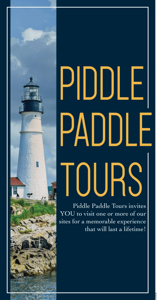
Piddle Paddle Tours: This trifold brochure showcases Piddle Paddle Tours’ offerings, including private and group tours, boat rentals, and more. Featuring a dynamic cover, informative pages, and a back cover with contact details, the brochure uses engaging imagery and concise text to highlight each activity.
The color palette of blue and yellow was carefully chosen: blue represents water and trust, while yellow evokes happiness and adventure. These colors aim to inspire excitement and positive emotions in potential customers, encouraging them to explore and book a tour.
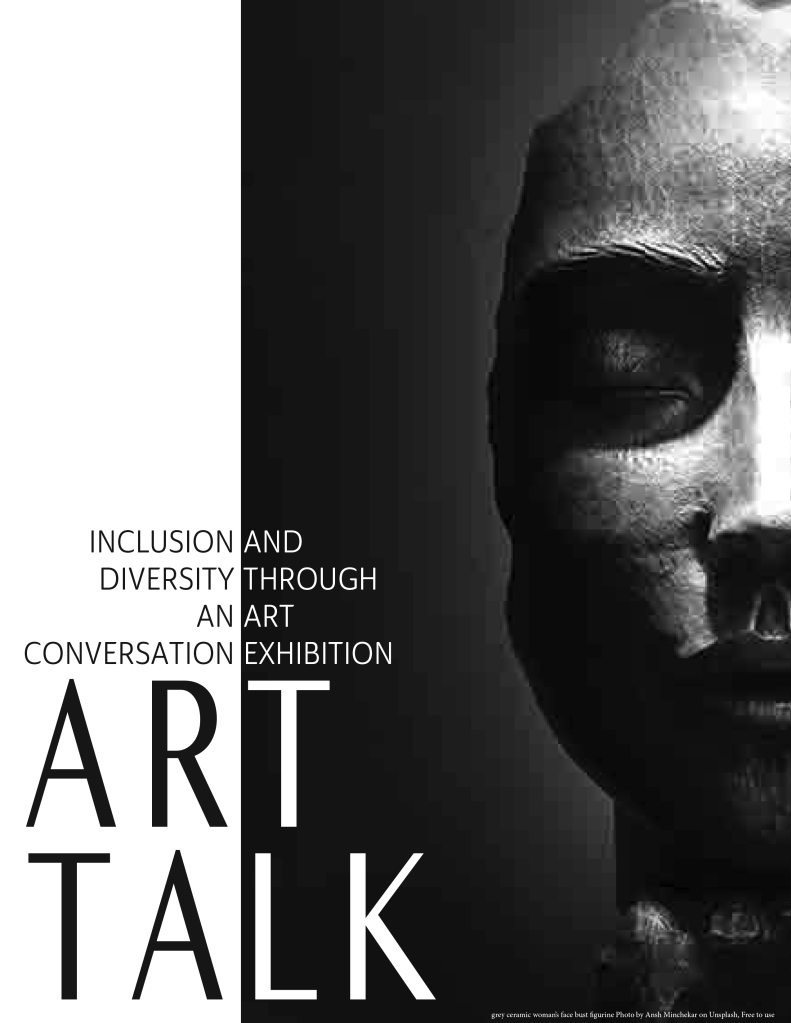
Art Talk: This short booklet showcases the artwork and story of the artist Arturo F. The design is tailored for a printed format, intended to be handed out during the artist’s exhibition in a museum. The layout features bold, modern typography paired with large-scale imagery of the artwork, allowing the visuals to take center stage. The design blends professionalism with artistic flair, reflecting both the sophistication of the museum setting and the creativity of the artist. A careful balance was achieved through a clean and minimal color palette, ensuring that the artwork remains the focal point, while the typography adds visual interest and content. The overall aesthetic is meant to engage viewers, offering a glimpse into Arturo F.’s work while enhancing the museum experience.
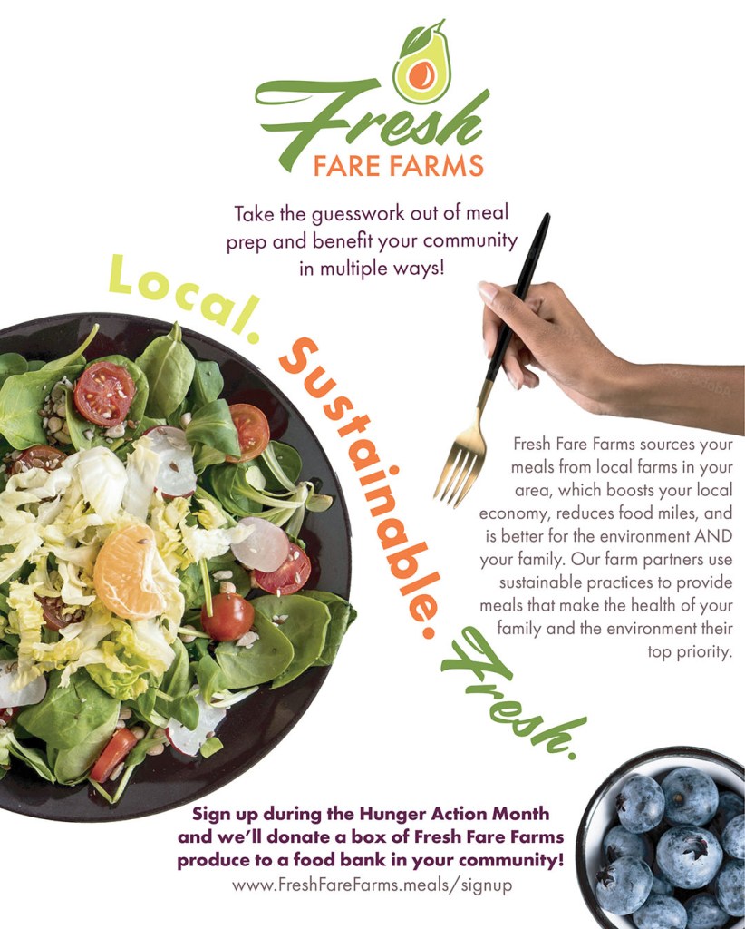
This design was created for a magazine feature to highlight Fresh Fare Farms’ commitment to healthy, organic meal options. The hand, depicted with an African American skin tone, emphasizes the brand’s inclusivity and its appeal to a diverse, younger audience. The imagery not only showcases the fresh, nutritious meals but also tells a story—the hand reaches out as if irresistibly drawn to the food, symbolizing the excitement and anticipation of enjoying something truly delicious.
This design is part of a larger design package for Fresh Fare Farms where each piece maintains a cohesive style yet is still tailored for its specific use. All Fresh Fare Farms designs share a consistent color palette, typography, and brand identity. Other designs for Fresh Fare Farms are included throughout my portfolio.
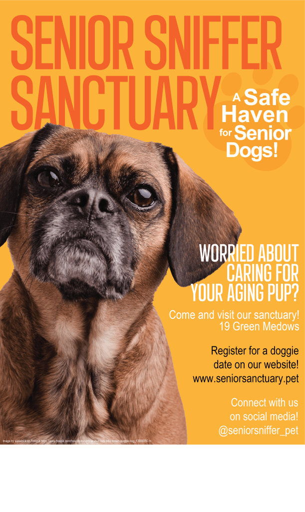
This design was created to evoke warmth and optimism for Senior Sniffer Sanctuary, a haven for older dogs. The large-scale imagery, paired with a vibrant orange color palette, is designed to create a visual that feels both welcoming and energetic. Orange was chosen for its associations with positivity, youthfulness, and enthusiasm—qualities that dogs, no matter their age, naturally exude. The design seeks to foster an emotional connection with the audience, enhanced by the imagery that gives the feeling of direct eye contact with the featured dog.