Miscellaneous:
Although these designs may not fit into more traditional or expected design settings, I felt it was important to include them in my portfolio. Each piece is thoughtfully crafted to serve its specific purpose—whether it’s a mockup layout for user experience or a train ticket. I focus on ensuring that these designs not only fulfill their functional requirements but also make a strong visual impact.
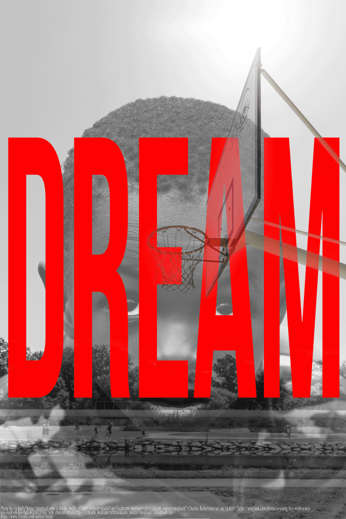
This graphic piece features a young boy gazing upward at a basketball hoop, captured in a black-and-white color palette to evoke a sense of focus and timelessness. Positioned boldly across the image is the word DREAM, rendered in striking red, modern typography. The contrast between the monochrome background and the vivid lettering draws immediate attention to the message, reinforcing the idea that ambition and vision start young. This design is meant to inspire—reminding viewers that big dreams often begin with small, determined steps. Through its minimal color use and powerful composition, the piece speaks to resilience, hope, and the boldness of chasing goals.
This mobile-friendly train ticket design was created to prioritize user experience by providing all essential travel information in a clear and visually appealing format. The layout features a clean design with high contrast for easy readability, even in low-light conditions. Key details like departure time, platform, and seat number are emphasized through thoughtful use of typography and color. The design blends traditional ticket elements with modern digital features, ensuring convenience and usability. The result is a sleek, functional ticket that enhances the passenger’s travel experience while maintaining a professional brand identity for the railroad.

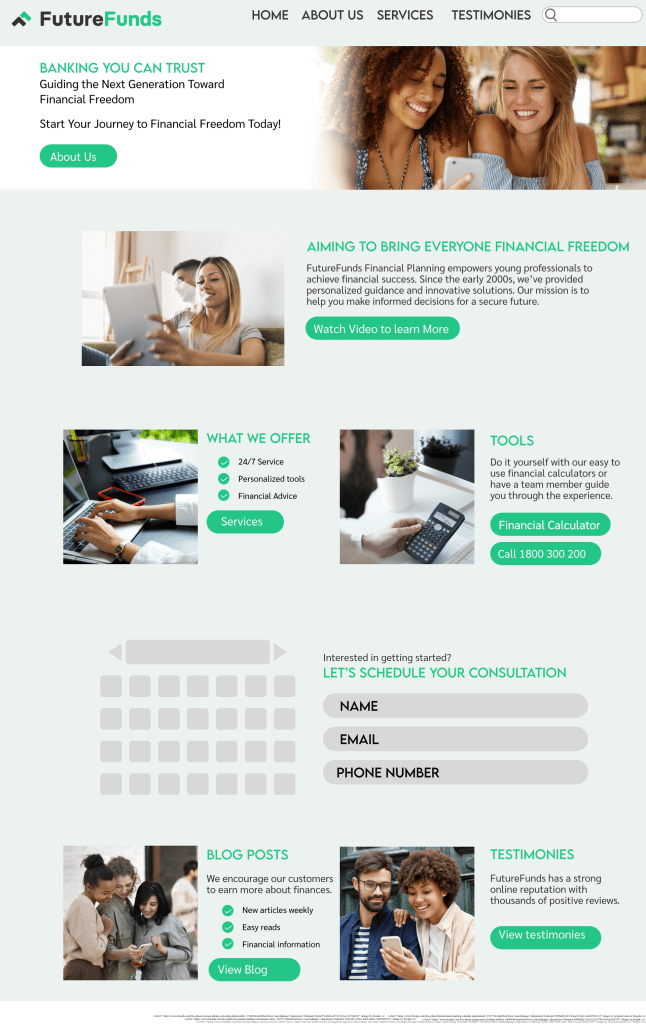
This mock-up for Future Funds’ website layout prioritizes user experience, readability, and a professional appearance. Designed for a financial company, the color palette uses green, aligning with the company’s logo and symbolizing money. Green also represents nature, growth, renewal, and harmony—values I wanted customers to associate with their finances. The goal was to create a calming and reassuring environment, helping users feel at ease when navigating a topic that can often be stressful. The design blends functionality with a sense of peace and trust, enhancing the overall user experience.
